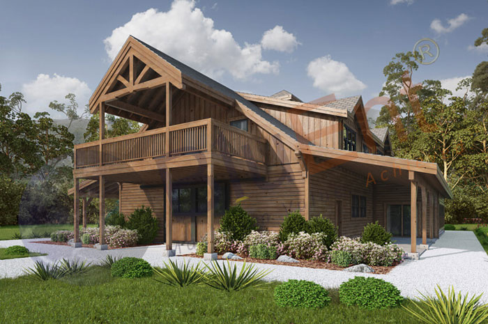
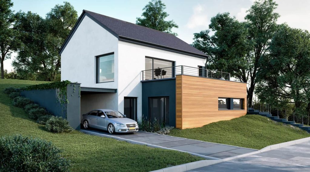
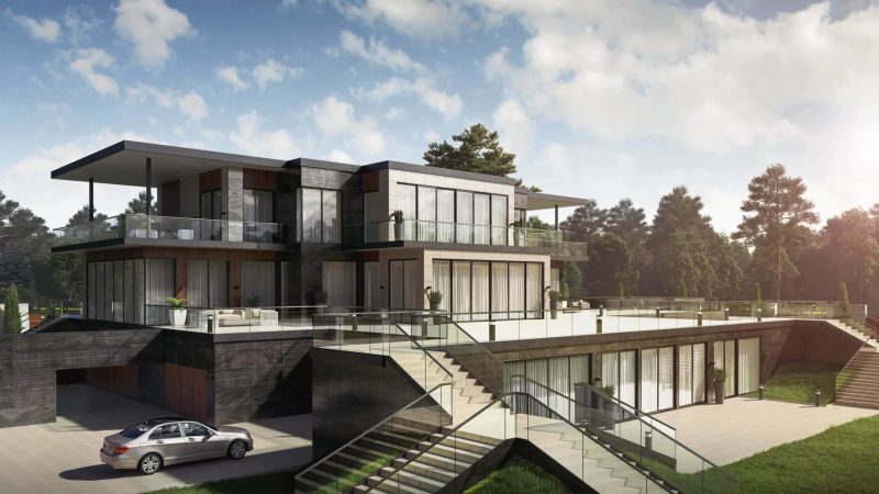
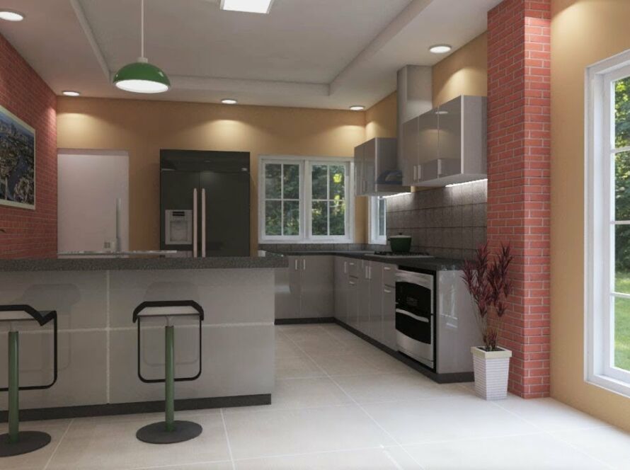
Architectural rendering is the process of creating two-dimensional and three-dimensional images of a proposed architectural design. The purpose of this type of rendering is to give the viewer an accurate representation of what the final product will look like. There are many different software programs that can be used for architectural rendering, but the most important part of the process is the artist’s ability to create a realistic image. In this blog post, we will explore some of the different techniques that are used in architectural rendering. We will also take a look at how these techniques have evolved over time and how they are being used today.
Background of architectural rendering
Architectural rendering is the process of creating two-dimensional and three-dimensional images of a proposed architectural design. This technique is often used by architects to communicate their designs to clients, investors, and other interested parties.
There are many different types of architectural rendering techniques, each with its own strengths and weaknesses. The most common type of rendering is photorealistic rendering, which aims to create an image that looks exactly like a photograph. Another popular type of rendering is conceptual rendering, which focuses on conveying the overall idea or concept of the design rather than creating a realistic image.
No matter what type of architectural rendering technique you use, the goal is to create an accurate representation of your proposed design. The better your renderings look, the easier it will be to sell your ideas to clients and investors.

Different types of architectural rendering techniques
There are different types of architectural rendering techniques that can be used to create realistic images of proposed buildings or modifications to existing structures. The most common techniques include:
- Pencil sketching
- Watercolor painting
- Airbrushing
- Computer-aided design (CAD)
- 3D modeling and rendering
- Photorealistic rendering.
- Traditional hand-drawn renderings
- Digital photography
- VRay and Maxwell Render
Each technique has its own advantages and disadvantages, and the type of technique used will often depend on the specific project requirements. For example, CAD is often used for more technical or complex projects, while hand-drawn sketches can be used for more creative or artistic designs.
Perspective in architectural rendering
Perspective in architectural rendering helps to create the illusion of depth and space on a two-dimensional surface. It can be used to create an accurate representation of a three-dimensional space, or to manipulate the space to achieve a desired effect. There are three types of perspective: one-point, two-point, and three-point.
One-point perspective is created by drawing lines from one fixed point to all other points in the scene. This type of perspective is often used for street scenes, where the viewer is looking down a long straight road. The vanishing point is typically placed on the horizon line.

Two-point perspective is created by drawing lines from two fixed points to all other points in the scene. This type of perspective is often used for buildings, where the viewer is looking at the front and side of the building at once. The vanishing points are typically placed on either side of the horizon line.
Three-point perspective is created by drawing lines from three fixed points to all other points in the scene. This type of perspective is often used for landscapes, where the viewer is looking up at tall mountains or down into a deep valley. The vanishing points are typically placed above or below the horizon line.
The importance of color in architectural rendering
Color is one of the most important aspects of architectural rendering. It can be used to create contrast, add visual interest, and set the mood or tone of a scene. Color can also help to accentuate certain features or bring out hidden details.
When choosing colors for your renderings, it is important to consider the overall color scheme of the project. You will want to use colors that complement each other and work well together. It is also important to think about the light sources in the scene and how they will affect the colors. For example, if you are rendering a daytime scene, you will want to use brighter colors; if you are rendering a nighttime scene, you will want to use darker colors.
In addition to considering the project’s overall color scheme, you should also pay attention to the individual colors of each element in the scene. For instance, you may want to use a different color for the walls than for the floor or furniture. This can help to create a sense of depth and dimension in your rendering.
Finally, don’t be afraid to experiment with color! Try out different combinations and see what looks best. With so many possibilities, there is no wrong way to use color in your architectural rendering!
Line drawing in architectural rendering
Line drawings are often used in architectural renderings to help communicate the overall design of a space. They can be used to show the floor plan, elevations, or even just a general idea of the layout. Line drawings can be done by hand or created digitally.
When creating a line drawing, it is important to use clear, concise lines that accurately depict the space. The drawing should be to scale and include all relevant details. It is also helpful to add color or shading to the drawing to make it more realistic.
Line drawings can be a great way to quickly convey the overall design of a space. They are especially helpful when presenting ideas to clients or other stakeholders. With careful planning and execution, line drawings can effectively communicate the vision for a space.


Texture in architectural rendering
Texture is an important aspect of architectural rendering. It can add realism to a scene and help convey the materials used in a building. There are many ways to create texture in a render, including using bump maps, normal maps, and displacement maps.
Bump maps are images that are used to create the illusion of depth in a render. They are often used to give the appearance of textured surfaces, such as stone or wood. Normal maps are similar to bump maps, but they provide more detailed information about the surface normals of an object. This allows for more realistic lighting and shadow effects. Displacement maps are used to actually modify the shape of an object in a render. This can be used to create things like ripples in water or wrinkles in cloth.
When creating textures for a render, it is important to keep in mind how these textures will interact with light and shadow. Different types of textures will react differently to light, so it is important to choose textures that will complement the lighting conditions of the scene.
Pattern in architectural rendering
Patterns are a crucial element in architectural rendering. By understanding and utilizing different types of patterns, architects can create unique and eye-catching designs that will make their buildings stand out from the rest.
There are many different types of patterns that can be used in architectural rendering, including geometric patterns, organic patterns, abstract patterns, and more. Each type of pattern has its own unique benefits that can help to create a variety of different effects.
Geometric patterns are often used to create a sense of order and symmetry in a design. They can also be used to add visual interest and depth to a flat surface.
Organic patterns are typically used to add a sense of movement and flow to a design. They can also help to create an illusion of depth.
Abstract patterns can be used to add texture and interest to a design. They can also be used to create a sense of balance or proportion in a composition.
Rhythm in architectural rendering
When it comes to creating an architectural rendering, one of the most important aspects is the rhythm. This is what will help create a sense of movement and flow within the image, and ultimately make it more visually appealing.
There are a few different ways that you can create rhythm in your rendering. One way is to use line work. This can be done by using different widths and weights of lines, as well as varying the directionality. Another way to create rhythm is through the use of color. You can use different values, saturation levels, and hues to create a sense of movement within the image. And finally, texture can also be used to create rhythm. By varying the types and amount of texture within the image, you can create a sense that things are moving and flowing.
Ultimately, it’s up to you how you want to use rhythm in your rendering. Just remember that it’s an important aspect that can really make or break the overall look of the image. So take some time to experiment with different techniques and see what works best for you!
Emphasis in architectural rendering
Emphasis in architectural rendering is the process of using light and shadow to create a focal point within the image. This can be done by manipulating the values of light and dark, or by adding textures and patterns to certain areas.
Rendering techniques that emphasize certain areas are often used to draw attention to specific features of a building or space. For example, if an architect wants to highlight the sweeping curves of a staircase, they may use light and shadow to create a sense of movement and flow. Alternatively, they may add texture to the stair treads to make them stand out from the rest of the image.
In addition to drawing attention to specific features, emphasis can also be used to create a sense of depth and dimensionality. By adding light and shadow around the perimeter of an object, it will appear as if it is receding into the distance. This trick is often used in exterior renderings to give the viewer a sense of the scale of the space.
By carefully controlling the values of light and dark, architects can use emphasis to control where the viewer’s eye is drawn within an image. By understanding how these techniques work, architects can create renderings that are both aesthetically pleasing and informative.

Proportion and scale in architectural rendering
When it comes to creating an accurate representation of a space, one of the most important things to consider is the proportion and scale. This is especially true in architectural rendering, where the goal is to create a realistic and lifelike image of a proposed design.
There are a few different ways that architects can control the proportion and scale in their renderings. One common method is to use a grid system. This involves overlaying a grid on top of the image, which helps to ensure that all elements are properly scaled in relation to one another.
Another way to control proportion and scale is through the use of perspective. By manipulating the angle from which the viewer is seeing the image, an architect can make certain elements appear larger or smaller than they actually are. This can be a helpful tool for making sure that all details are visible and easily understandable.
Finally, color can also be used to create a sense of proportion and scale. Lighter colors tend to recede into the distance, while darker colors come forward. This can be helpful for creating depth and dimension in a rendering.
By paying careful attention to proportion and scale, architects can create realistic and lifelike renderings that accurately represent their proposed designs.


